什么是 Web Components
Web Component 并非单一的技术,而是由一系列 W3C 定义的浏览器标准组成,使得开发者可以构建出浏览器原生支持的组件。这些标准包括:
- Custom Elements:带有特定行为且用户自命名的 HTML 元素
- Shadow DOM:对标签和样式的一层 DOM 包装
- HTML Templates:可复用的 HTML 标签,提供了和用户自定义标签相结合的接口
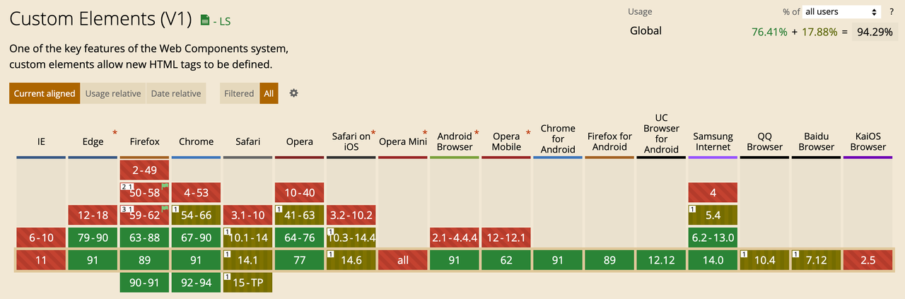
Custom Elements
Web component 提供了自定义标签的方法,可以通过 CustomElementRegistry.define() 方法用来注册一个 custom element,该方法接受以下参数:
- 表示所创建的元素名称的符合 DOMString 标准的字符串。custom element 的名称不能是单个单词,且其中必须要有短横线。
- 用于定义元素行为的类 。
- 可选参数,一个包含 extends 属性的配置对象,是可选参数。它指定了所创建的元素继承自哪个内置元素,可以继承任何内置元素。
customElements.define('my-element', WordCount, { extends: 'p' });
custom elements 可以分为两种:
- Autonomous custom elements 是独立的元素,它不继承其他内建的HTML元素。可以直接写成HTML标签的形式,或者是在js中使用:
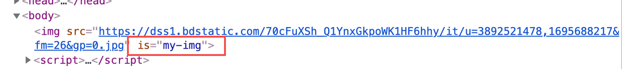
document.createElement("my-element")。 - Customized built-in elements 继承自基本的HTML元素。在创建时,你必须指定所需扩展的元素(正如上面例子所示),使用时,需要先写出基本的元素标签,并通过 is 属性指定custom element的名称
<p is="my-element">, 或者document.createElement("p", { is: "my-element" })。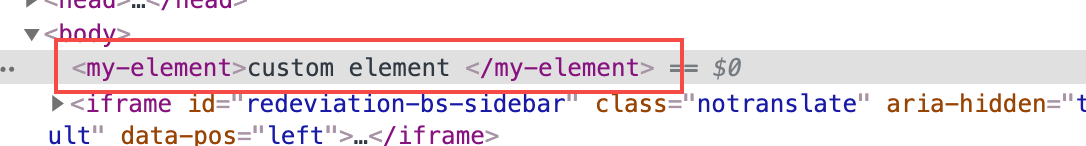
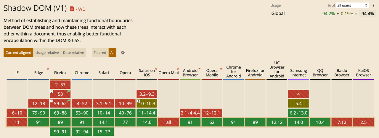
Shadow DOM
Shadow DOM 可以将标记结构、样式和行为隐藏起来,并与页面上的其他代码相隔离,保证不同的部分不会混在一起,可使代码更加干净、整洁。Shadow DOM 允许将隐藏的 DOM 树附加到常规的 DOM 树中——它以 shadow root 节点为起始根节点,在这个根节点的下方,可以是任意元素,和普通的 DOM 元素一样。
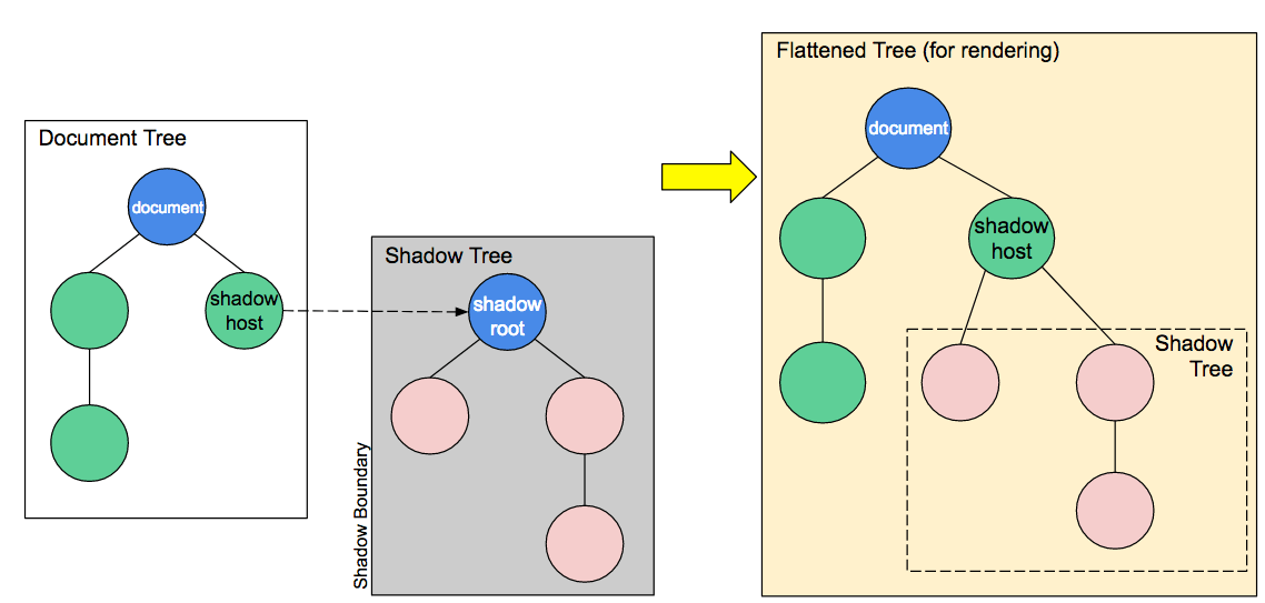
- Shadow host:一个常规 DOM节点,Shadow DOM 会被附加到这个节点上。
- Shadow tree:Shadow DOM内部的DOM树。
- Shadow boundary:Shadow DOM结束的地方,也是常规 DOM开始的地方。
- Shadow root: Shadow tree的根节点。
<my-element name="web component"></my-element >

<script>
class MyElement extends HTMLElement {
  connectedCallback() {
    const shadow = this.attachShadow({mode: 'open'});
    shadow.innerHTML = `<p>
      Hello, ${this.getAttribute('name')}
    </p>`;
  }
}
window.customElements.define('my-element', MyElement);
</script>
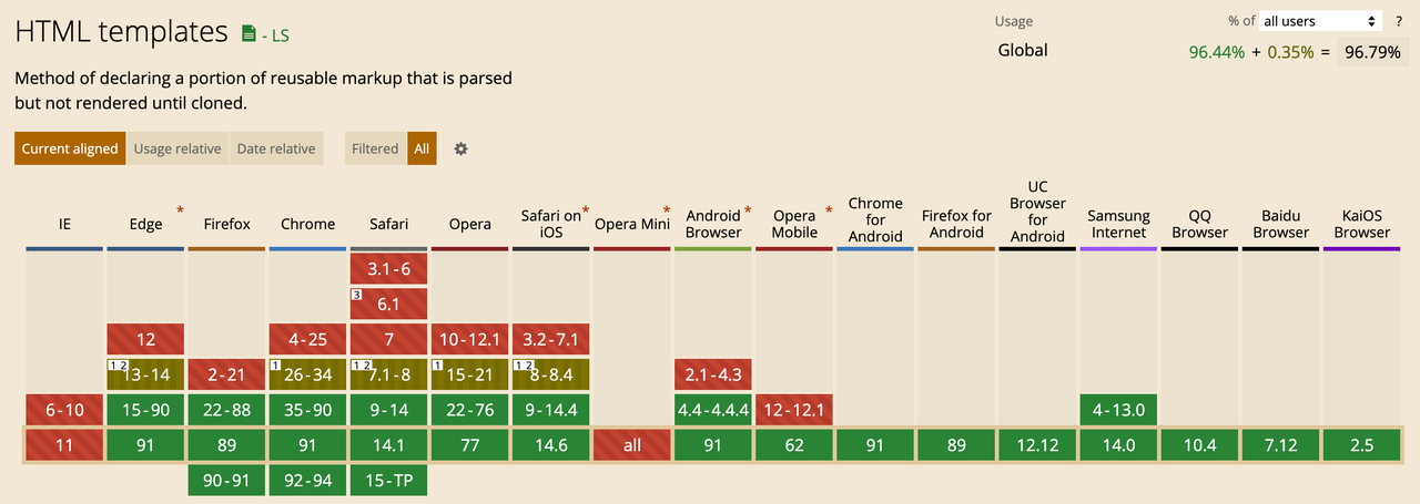
HTML Templates
<template> 是一种 HTML 元素,所以一个含内容的模板所具备的最基本形式如下:
<template>
  <h1>Hello world</h1>
</template>
在浏览器中运行这段代码会显示空白页面,因为浏览器并没有渲染模板元素内容。这种方式的强大之处在于它允许我们保存自定义内容(或内容结构),以供后续使用,而不需要使用 JavaScript 来动态编写 HTML 代码。 模板可以包含任意 HTML,包括脚本和样式元素。例如:
<template id="template">
  <script>
    const button = document.getElementById('click-me');
    button.addEventListener('click', event => alert(event));
  </script>
  <style>
    #click-me {
      all: unset;
      background: tomato;
      border: 0;
      border-radius: 4px;
      color: white;
      font-family: Helvetica;
      font-size: 1.5rem;
      padding: .5rem 1rem;
    }
  </style>
  <button id="click-me">Log click event</button>
</template>
<slot> 使用与 Vue 的用法基本一模一样
<!-- my-paragraph -->
<p><slot name="my-text">My default text</slot></p>
<my-element>
  <span slot="my-text">Let's have some different text!</span>
</my-element>
生命周期
- constructor:组件被 create 的时候会被调用,整个生命周期中最早触发也只会触发一次,通常可以在这里做一些初始化私有变量、记录数据的一些操作;但是出于性能和职责分离的考虑,不建议在这里做一些 DOM 相关的事情。
- connectedCallback:组件被连接到 DOM Tree 的时候会触发,这个时机包括节点被插入节点树、节点被从节点树中移动,所以它可能会被触发多次。
- disconnectedCallback:组件被从 DOM Tree 中移除的时候触发。
- adoptedCallback:当 custom element被移动到新的文档时,被调用。adoptNode
- attributeChangedCallback:当组件的 attribute 发生变化的时候触发,它的三个形参分别是 name, oldValue, newValue,如果声明了 properties 对象,对 attribute 的相应值变化也会触发这个回调。需要注意的是,如果覆盖了组件的 observedAttributes 静态方法,properties 对象中声明的值不会触发,它会按照覆盖的 observedAttributes 静态方法的返回值为准。
class MyComponent extends HTMLElement {
  constructor() {
    super()
  }

  connectedCallback(){
    // 当自定义元素第一次被连接到文档DOM时被调用
  }
  disconnectedCallback(){
    // 当自定义元素与文档DOM断开连接时被调用
  }
  adoptedCallback(){
    // 当自定义元素被移动到新文档时被调用
  }
  attributeChangedCallback(){
    // 当自定义元素的一个属性被增加、移除或更改时被调用
  }
}
组件通信
父组件传递数据给子组件
- 通过 DOM 属性,不支持复杂对象的传递。
// parentWc
const parentTemplate = `<child-wc/>`;
class ParentWc extends HTMLElement {
  // ...
  connectedCallback() {
      const child = this.shadowRoot.querySelector('child-wc')
      child.setAttribute('text', 'web component');
  }
}
window.customElements.define('parent-wc', ParentWc)
// childWc
class ChildWc extends HTMLElement {
  // 必须先生命需要监听的属性
  static get observedAttributes() {
    return ['text'];
  }

  attributeChangedCallback(name, oldValue, newValue) {
    if(name==='text' & oldValue !== newValue) {
      console.log(newValue)
    }
  }
}
window.customElements.define('child-wc', ChildWc);
- 第二种方式通过组件实例属性。这是目前主流的传值方式,支持复杂对象的传递。
// parentWc
class ParentWc extends HTMLElement {
   // ...
  connectedCallback() {
     this.shadowRoot.querySelector('child-wc').data.text = { type: 'web component'}
  }
}
window.customElements.define('parent-wc', ParentWc)
// childWc
class ChildWc extends HTMLElement {
  constructor() {
    super();
    this.data = {text: {type: 'child web component' } }
    Object.defineProperty(this.data, 'text', {
      set: value => {
        console.log(value)
      }
    })
  }
}
子组件传递数据给父组件
- 第一种通过事件监听,利用原生 CustomEvent 函数来创建自定义事件,然后在子组件实例上派发此事件以及数据,同时父组件进行监听,可以借助 document 设置事件总线,进行跨组件全局通信。
// childWc
class ChildWc extends HTMLElement {
  // ...
  connectedCallback() {
    const event = new CustomEvent('custom-event', {
          detail: {
              value: 'child web component'
          }
      });
     this.dispatchEvent(event);
  }
window.customElements.define('child-wc', ChildWc)
// parentWc
class ParentWc extends HTMLElement {
  // ...
  connectedCallback() {
    const child = this.shadowRoot.querySelector('child-wc')
    child.addEventListener('custom-event', ({ detail }) => {
       console.log(detail.value);
    })
  }
}
window.customElements.define('parent-wc', ParentWc)
- 第二种方式是直接调用父组件方法。
// parentWc
class ParentWc extends HTMLElement {
  // ...
  say(msg) {
    console.log(msg);
  }
}
window.customElements.define('parent-wc', ParentWc)
class ChildWc extends HTMLElement {
  // ...
  connectedCallback() {
      this.getRootNode().host.say('child web component')
  }
}
window.customElements.define('child-wc', ChildWc)
Shadow DOM 样式封装
目前,定义一个 shadow DOM 节点样式的唯一方法就是在 shadow root 的内部 HTML 中添加一个 <style> 元素。这种方法几乎在所有情况下都能正常工作,因为浏览器会在可能的情况下对这些组件中的样式表进行重写。在 shadow DOM 中我们可以使用link 或者 @import 引入外部样式,但是必须明确元素样式表的位置。
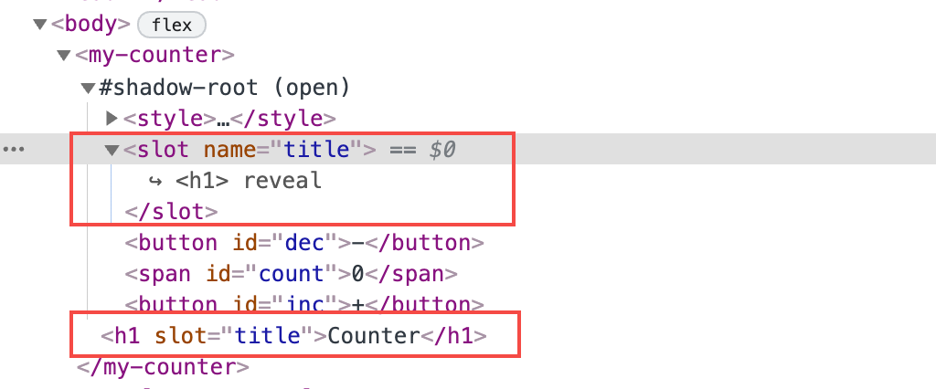
slot 节点设定样式
不会移动用户的 Light DOM, 中内容依然会在原处,这就意味着可以直接在外层直接设置对应的样式。
<style>
  h1 {
     ...
  }
</style>

<my-counter>
  <h1 slot="title">Counter</h1>
</my-counter>
::slotted<selector> 可以在 shadow DOM 中为<slot>中节点设置样式,::slotted<selector>设置的样式只能在最顶层的节点生效:
<!-- my-counter -->
<style>
   ::slotted {
      color: red;
   }
   ::slotted(.description) {
      color: blue;
   }
   <!-- 不生效 -->
   ::slotted(.lib),
   ::slotted(.description .lib) {
      color: green;
   }
</style>

<my-countr>
  <h1 slot="title">Counter</h1>
  <p class="description">
      A counter build by <span class="lib">web component</span>
  </p>
</my-counter>
css 自定义属性
css 自定义属性可以传入 shadow DOM 内部,从而调整内部样式,从概念上看,这与<slot>类似, 可以简单理解为:创建“样式占位符”以便进行替换:
<!-- main page -->
<style>
   :root {
      --primary: red;
   }
</style>


<!-- my-counter -->
<style>
   div {
     background-color: var(--primary, blue);
   }
</style>
可构造的样式表
为了更好地复用样式,可构造的样式表提供了类似于编写普通 CSS 并在多个节点之间共享这些样式的方式。
const everythingTomato = new CSSStyleSheet();
everythingTomato.replace('* { color: tomato; }');

document.adoptedStyleSheets = [everythingTomato];

class MyCounter extends HTMLElement {
  constructor() {
    super();
    this.adoptedStyleSheets = [everythingTomato];
  }

  connectedCallback() {
    this.shadowRoot.innerHTML = `<h1>CSS colors are fun</h1>`;
  }
}
part 伪元素
::part 可以结合其他伪类/元素使用,不能再加上选择器
<!-- main page -->
<style>
   tab-element::part(tab) {
      color: grey;
   }
   tab-element::part(tab):hover {
      color: black;
   }
   tab-element::part(active) {
      color: black;
   }

    <!-- 不生效 -->
    tab-element::part(tab) span {
      color: white;
   }
</style>


<!-- tab-element -->
<template>
   <div part="tab active">
     <span part="tab">
     tab1
     </span>
   </div>
   <div part="tab">
   <span>
     tab2
     </span>
   </div>
</template>
Demo: 实现计数器
<!DOCTYPE html>
<html lang="en">
  <head>
    <meta charset="UTF-8" />
    <meta http-equiv="X-UA-Compatible" content="IE=edge" />
    <meta name="viewport" content="width=device-width, initial-scale=1.0" />
    <title>web component demo</title>

    <style>
      body {
        display: flex;
        justify-content: center;
        padding: 50px;
      }
      h1 {
        font-size: 30px;
        text-align: center;
        margin-bottom: 40px;
      }
    </style>

  </head>
  <body>
    <my-counter>
      <h1 slot="title">Counter</h1>
    </my-counter>
    <template>
      <style>
        span {
          width: 4rem;
          display: inline-block;
          text-align: center;
        }

        button {
          width: 4rem;
          height: 4rem;
          border: none;
          border-radius: 10px;
          background-color: seagreen;
          color: white;
        }
      </style>
      <slot name="title"></slot>
      <button id="dec">-</button>
      <span id="count"></span>
      <button id="inc">+</button>
    </template>
    <script>
      const template = document.querySelector("template");

      class MyCounter extends HTMLElement {
        constructor() {
          super();
          this.count = 0;
          this.attachShadow({ mode: "open" });
        }

        connectedCallback() {
          this.shadowRoot.appendChild(template.content.cloneNode(true));
          this.shadowRoot.getElementById("inc").onclick = () => this.inc();
          this.shadowRoot.getElementById("dec").onclick = () => this.dec();
          this.update(this.count);
        }

        inc() {
          this.update(++this.count);
        }

        dec() {
          this.update(--this.count);
        }

        update(count) {
          this.shadowRoot.getElementById("count").innerHTML = count;
        }
      }

      window.customElements.define("my-counter", MyCounter);
    </script>
  </body>
</html>
Live demo: https://webcomponents.dev/edit/Osbw4TzJEizqkd5ZkHOs/www/index.html
与现代框架对比
https://webcomponents.dev/blog/all-the-ways-to-make-a-web-component/
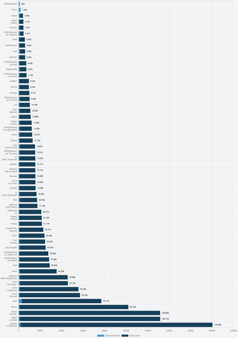
Bundle Size
上面计数器基于各种框架/库实现rollup打包大小如下:
单个组件:
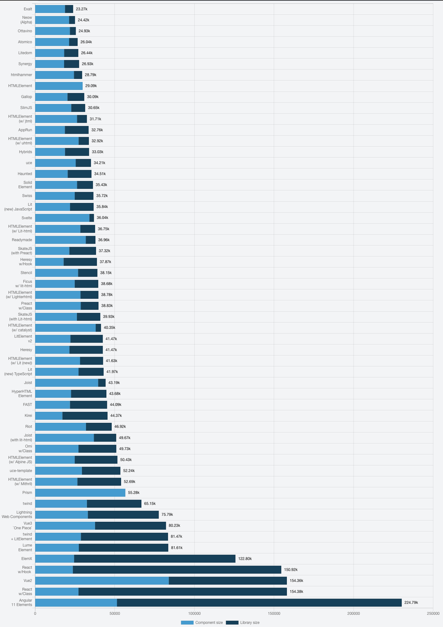
 打包30个:
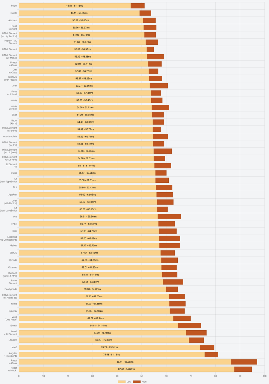
 Performance
单个页面中 50个 JS 解析+DOM Tree 创建耗时:
Performance
单个页面中 50个 JS 解析+DOM Tree 创建耗时:
开源实现
React/Vue
React 和 Web Components 为了解决不同的问题而生。Web Components 为可复用组件提供了强大的封装,而 React 则提供了声明式的解决方案,使 DOM 与数据保持同步。两者旨在互补。作为开发人员,可以自由选择在 Web Components 中使用 React,或者在 React 中使用 Web Components,或者两者共存。 React 和 Vue 开发 Web Component 的思路基本一样,都是用 Custom Elements 包装对应的 React/Vue 组件,以React 为例:
import React from 'react';
import ReactDOM from 'react-dom';

export default function defineElement(Component, elementName, observedAttributes = [], events = []) {
  class CustomElement extends HTMLElement {
    constructor() {
      super();
      observedAttributes.forEach(property => Object.defineProperty(this, property, { set: value => this.setterProxy(property, value) }));
      this.events = events;
    }

    setterProxy(name, value) {
      this.attributeChangedCallback(name, value, value); // Careful, this is a bug, since the oldVal always equals the new val
    }

    connectedCallback() {
      const props = [...this.attributes].reduce((props, attribute) => ({ ...props, [attribute.name]: attribute.value }),
        { root: this });

      const instance = (<Component {...(props)} />);
      this.assignEvents(instance);
      ReactDOM.render(instance, this);
      this.instance = instance;
      this.props = props;
    }

    attributeChangedCallback(name, oldValue, newValue) {
      const { instance } = this;
      if (!instance) return;
      const newProps = { ...(this.props), ...({ [name]: newValue }) };
      const newInstance = (<Component {...(newProps)} />);
      this.assignEvents(newInstance);
      ReactDOM.render(newInstance, this);
      this.instance = newInstance;
      this.props = newProps;
    }

    assignEvents(instance) {
      this.events.forEach(event => instance.props[event] = eventArgs => this.dispatchEvent(new CustomEvent(event, { detail: eventArgs })));
    }
  }

  CustomElement.observedAttributes = observedAttributes;
  window.customElements.define(elementName, CustomElement);
React 基于 bitovi/react-to-webcomponent 实现 React 转换 Web Component; Vue 基于 https://cli.vuejs.org/zh/guide/build-targets.html 设置构建目标为 wc 来产出 Web Component,也可以 https://github.com/vuejs/vue-web-component-wrapper 包装一下(需配合vue-style-loader)
Lit
Lit 是 Google 提供的一组开源库,可帮助开发者构建快速、轻量且适用于任何框架的组件,Lit vs React,上面计数器用Lit实现就变得非常简单:
import { LitElement, html, css } from "lit";
import { customElement, property } from "lit/decorators.js";

@customElement("my-counter")
export class MyCounter extends LitElement {
  static styles = css`
    div {
      display: inline-block;
      text-align: center;
      font-size: 30px;
      width: 50px;
      text-align: center;
    }

    button {
      width: 4rem;
      height: 4rem;
      border: none;
      border-radius: 10px;
      background-color: seagreen;
      color: white;
      font-size: 40px;
    }
  `;

  @state({type: Number})
  count: number = 0;

  render() {
    return html`
      <slot name="title"></slot>
      <button @click=${() => this.count--}>-</button>
      <div>${this.count}</div>
      <button @click=${() => this.count++}>+</button>
    `;
  }
}
“传统框架和 Web Components 结合最大的问题就在于运行时:单独分发的 WC 里面直接打包框架运行时,等于每个组件都要复制一份框架;不打包的话,又做不到开箱即用”。如何看待svelte 这个前端框架,Svelte 解决方案:https://dev.to/silvio/how-to-create-a-web-components-in-svelte-2g4j 跨框架使用 Demo 详见:https://webcomponents.dev/edit/8FfjYicF2OClmsUFivj0/www/index.html
兼容性
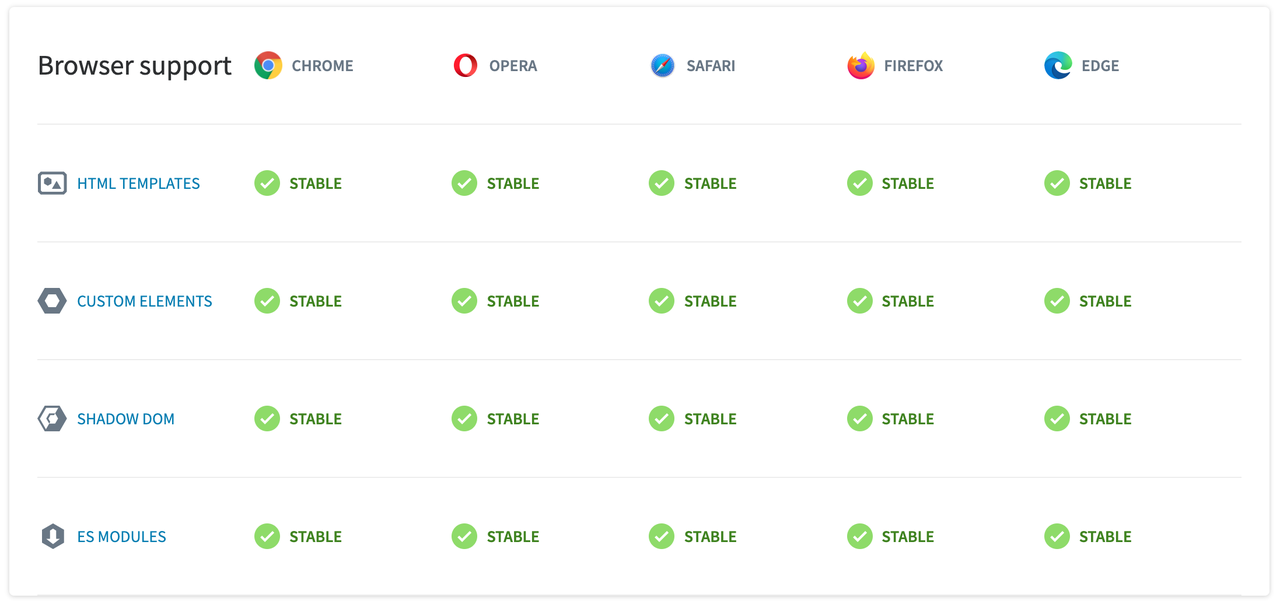
https://caniuse.com/?search=web%20components 对于不兼容的浏览器可以使用polyfills: webcomponents / polyfills,能够支持到IE11。
优势&劣势
优势:
- 原生支持,web components 依赖浏览器底层的实现,而不限定于某个特定的前端框架
- Shadow DOM 实现了真正的局部 CSS 作用域
- 标准,只有 HTML,CSS,JavaScript,使用它可以不像使用依赖库或者框架的组件一样去额外学习一些框架的特定语言。
劣势:
- API 偏底层操作,易用性不够
- Css-in-js,性能、可读性差
- 全局命名空间
- DOM操作,影响应用性能?
- 发展缓慢
参考文档:
- https://developers.google.cn/web/fundamentals/web-components
- https://webcomponents.dev/blog/all-the-ways-to-make-a-web-component/
- https://dev.to/emileperron/web-components-in-2021-the-good-the-bad-and-the-ugly-3kg
- https://labs.thisdot.co/author/luis-aviles
- https://css-tricks.com/encapsulating-style-and-structure-with-shadow-dom/
- https://vaadin.com/learn/tutorials/lit-element/state-management-with-redux
- https://github.com/obetomuniz/awesome-webcomponents
- https://github.com/nepaul/awesome-web-components
转载请注明出处和本文链接